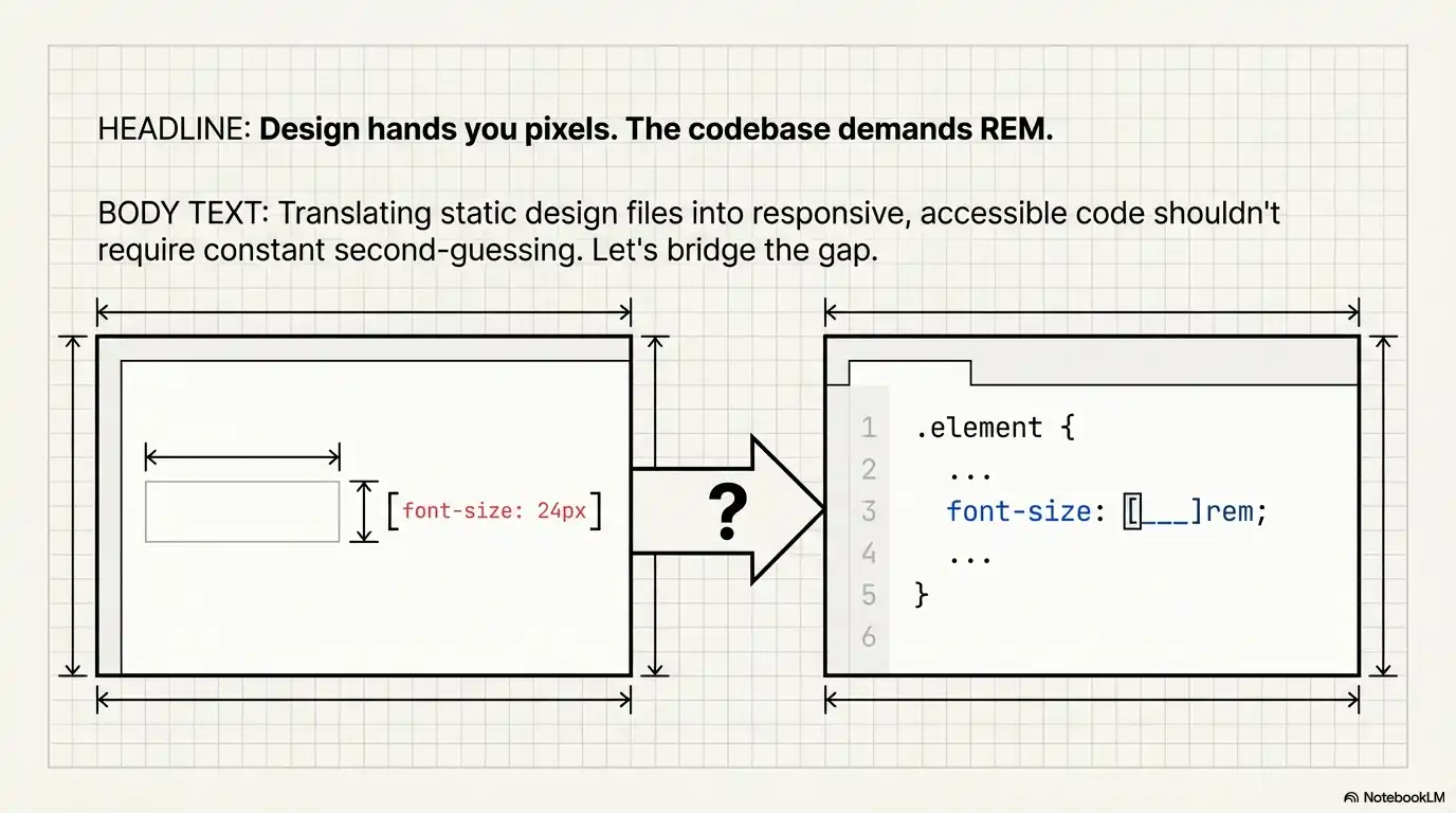
Every front-end developer hits the same friction point: your design file hands you values in pixels — 14px body text, 24px headings, 40px hero titles — but your codebase uses rem. You need to convert px to rem quickly, accurately, and without second-guessing the math.
This guide gives you everything you need: the exact px to rem formula, a conversion table covering the most common values, real CSS snippets you can copy into your projects, and a clear breakdown of px vs rem so you know when each unit actually makes sense.
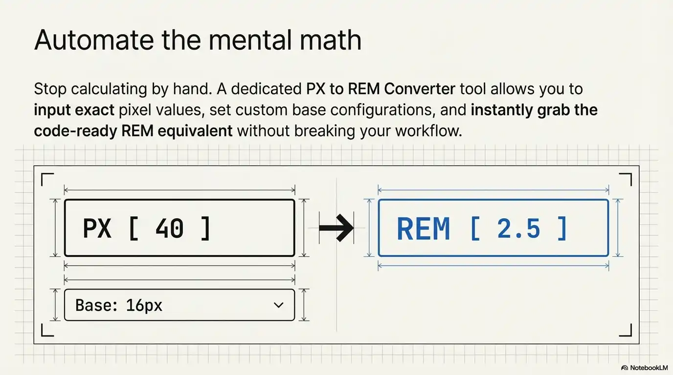
If you need an answer right now — no reading required — open our PX to REM Converter tool, type your pixel value, and get the rem equivalent instantly. For everything else, keep reading.
Before diving into conversion, let's make sure the units are clear.
PX (pixels) is a CSS absolute length unit. When you write margin: 20px, the browser renders exactly 20 pixels of margin. It doesn't care about parent elements, root settings, or user preferences. What you type is what you get.
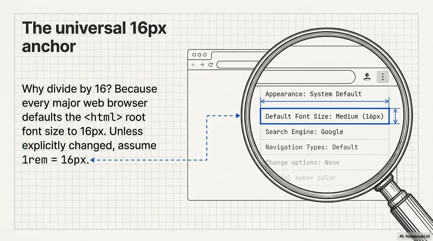
REM (root em) is a CSS relative length unit. Its computed pixel value depends entirely on one thing: the font-size set on the <html> element, which is called the root font size. Every major browser defaults this to 16px.
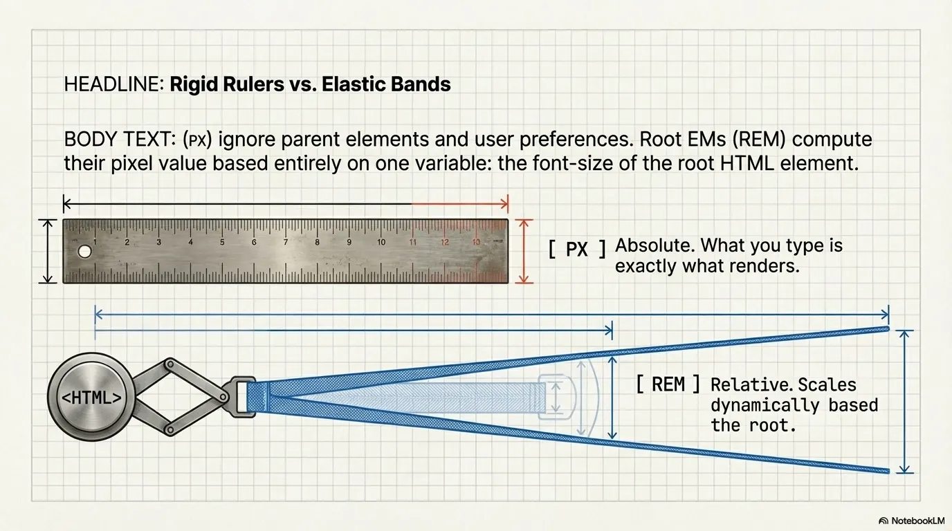
So when you write margin: 1.25rem, the browser calculates: 1.25 × 16 = 20px.
PX to REM conversion is the process of taking a known pixel value and expressing it as a rem value relative to the root font size. The purpose isn't just unit swapping — it's building CSS that scales with user preferences and responds to layout changes.
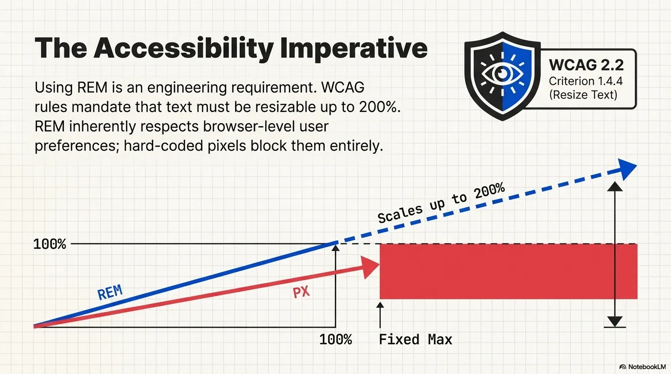
When a user with low vision sets their browser default font size to 20px, every rem value in your stylesheet recalculates automatically. Pixel values ignore that preference entirely. That's the fundamental reason rem exists and why converting your CSS px to rem matters for accessibility and responsive design.
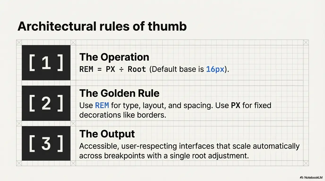
The conversion is a single division operation. No libraries, no build tools, no dependencies.
The base font size (also called the root font size) is the font-size on your <html> element. If you haven't set one, it's the browser default: 16px.
Practical example — convert 24px to rem:
Result: 24px = 1.5rem
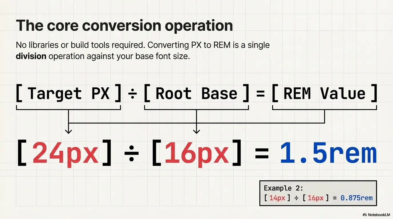
Another example — convert 14px to rem:
Result: 14px = 0.875rem
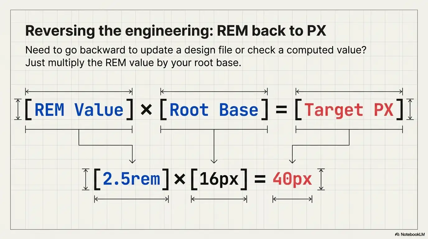
Going the other direction is just as simple. Multiply:
So 2.5rem × 16 = 40px.
Need to do this regularly? Our REM to PX Converter handles it instantly, including custom base sizes.
Some teams set html { font-size: 10px; } to simplify math (so 1rem = 10px, 1.4rem = 14px, etc.). Others use html { font-size: 62.5%; } which achieves the same result since 62.5% of 16px = 10px.
When the root changes, the formula stays the same — only the divisor changes:
/* Root = 10px */
/* 24px to rem → 24 ÷ 10 = 2.4rem */

html { font-size: 10px; }
h2 { font-size: 2.4rem; } /* computes to 24px */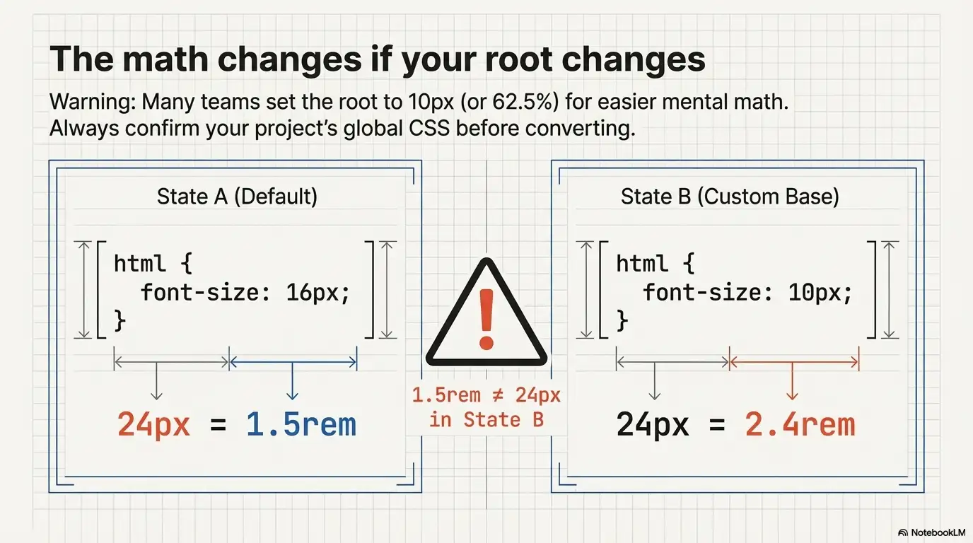
This is critical to remember: every px to rem conversion result depends on the base font size. A value of 1.5rem means 24px when the root is 16px, but 15px when the root is 10px. Always confirm your project's root before converting.
Our PX to REM Converter tool lets you set a custom base size so your conversions always match your actual project configuration.
This table covers the pixel values front-end developers search for most frequently. All values assume the default root font size of 16px.
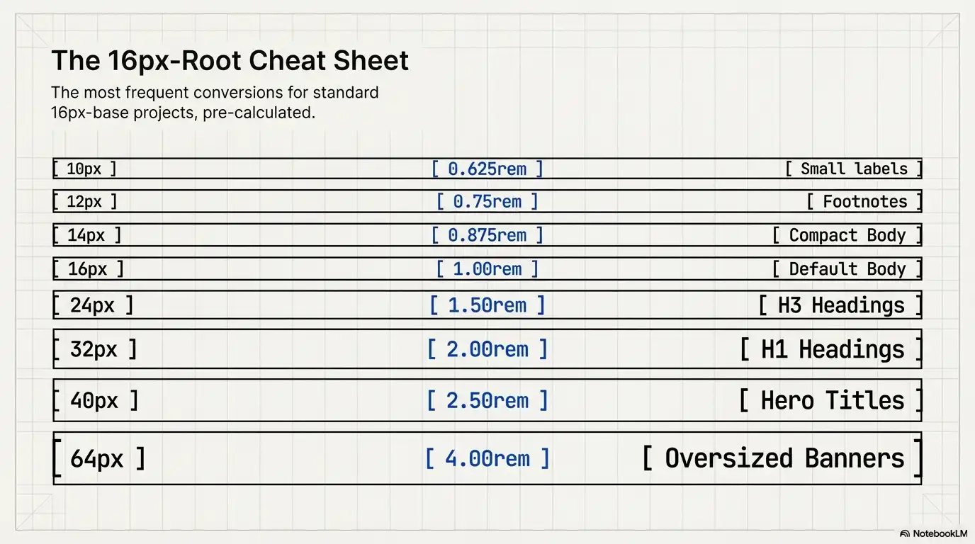
| Pixels | REM | Common Use Case |
|---|---|---|
| 10px | 0.625rem | Small labels, captions |
| 12px | 0.75rem | Secondary text, footnotes |
| 14px | 0.875rem | Body text (compact designs) |
| 16px | 1rem | Default body text, base size |
| 18px | 1.125rem | Body text (generous reading) |
| 20px | 1.25rem | Large body text, sub-headings |
| 24px | 1.5rem | H3/H4 headings |
| 28px | 1.75rem | H2 headings |
| 32px | 2rem | H1 headings |
| 36px | 2.25rem | Hero sub-titles |
| 40px | 2.5rem | Hero titles, display headings |
| 48px | 3rem | Large display text |
| 64px | 4rem | Oversized hero/banner text |
Quick lookups: Is 16px equal to 1rem? Yes — with the default 16px root. Is 10px to rem 0.625? Yes. Is 40px to rem 2.5? Yes. This table confirms it, and the formula proves it.
Want to convert a value not listed here? Use the PX to REM Converter — it handles any number, including decimals like 13px or 22px.
Theory is useful. Working code is better. Here are three patterns you'll actually use.
html {
  font-size: 16px; /* root / base font size */
}

body {
  font-size: 1rem;       /* 16px */
  line-height: 1.5;      /* unitless — scales with font size */
}

h1 { font-size: 2.5rem; }   /* 40px */
h2 { font-size: 2rem; }     /* 32px */
h3 { font-size: 1.5rem; }   /* 24px */
h4 { font-size: 1.25rem; }  /* 20px */

small { font-size: 0.75rem; } /* 12px */
Every heading and text size here adjusts automatically if the root font size changes — through CSS, a media query, or user preference.
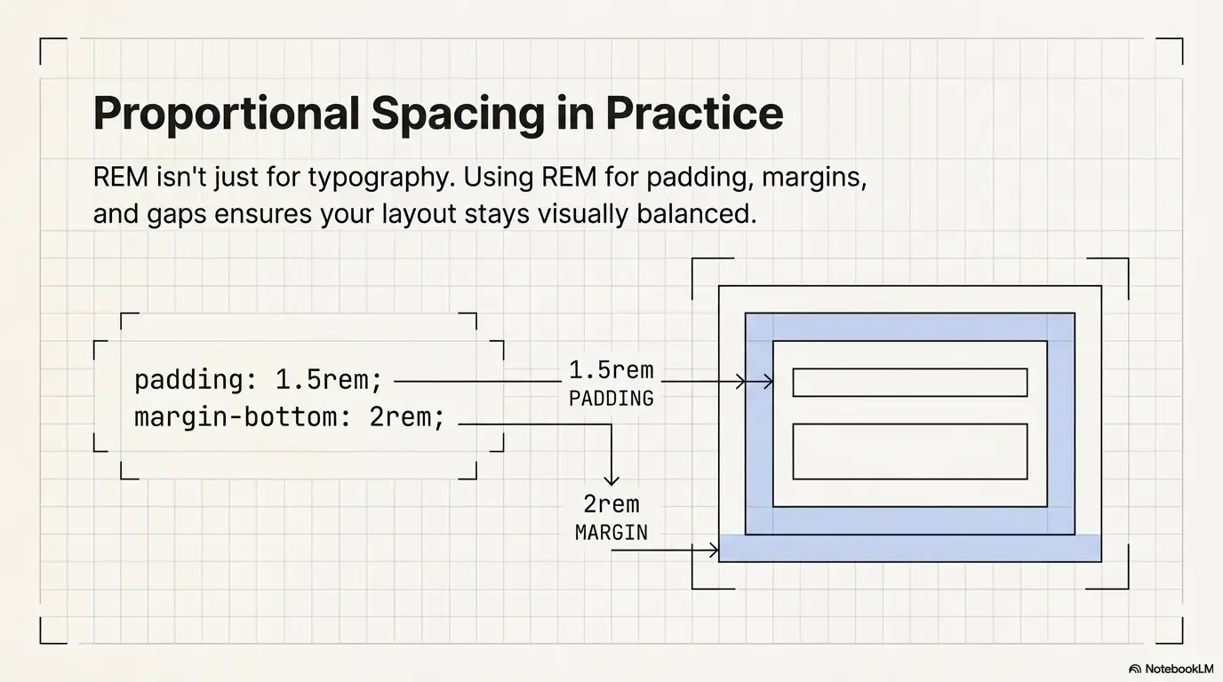
.card {
  padding: 1.5rem;          /* 24px */
  margin-bottom: 2rem;      /* 32px */
  border-radius: 0.5rem;    /* 8px */
}

.card__title {
  font-size: 1.25rem;       /* 20px */
  margin-bottom: 0.75rem;   /* 12px */
}

.card__body {
  font-size: 1rem;           /* 16px */
}
Using rem for padding and margins means your spacing scales proportionally with your typography. The layout stays visually balanced at any root size.
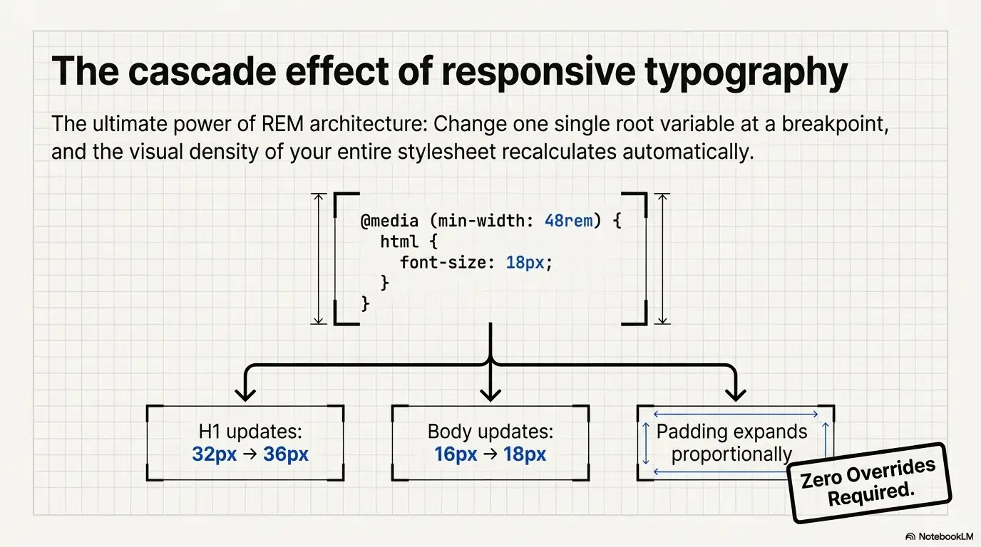
html {
  font-size: 16px;
}

@media (min-width: 768px) {
  html {
    font-size: 17px;
  }
}

@media (min-width: 1200px) {
  html {
    font-size: 18px;
  }
}
With this setup, every rem value across your entire stylesheet recalculates at each breakpoint. Your 2rem heading goes from 32px → 34px → 36px automatically. No extra rules. No overrides. This is the core of responsive typography with rem.
Here's a direct comparison for developers evaluating which unit to use and when.
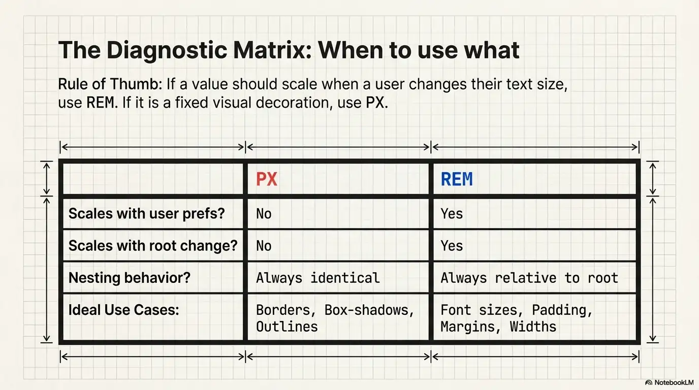
| PX | REM | |
|---|---|---|
| Type | Absolute | Relative to root font size |
| Scales with user prefs | No | Yes |
| Scales with root change | No | Yes |
| Nesting behavior | None — always the same value | None — always relative to root, not parent |
| Accessibility | Blocks user font scaling | Respects user font scaling |
| Mental model | What you type = what renders | Depends on root; requires knowing the base |
| Best for | Borders, box-shadows, outlines, fine detail | Font sizes, padding, margins, widths, layout |
| Responsive design | Manual updates per breakpoint | Automatic recalculation from root |
border: 1px solid #ccc — A 1px border should stay 1px. You don't want it scaling to 1.125px.box-shadow: 0 2px 4px rgba(0,0,0,0.1) — Shadow offsets are visual decoration, not content.outline-offset: 3px — Fine-grained visual adjustments.font-size: 1.125rem)padding: 1.5rem, margin: 2rem, gap: 1rem)max-width: 48rem)@media (min-width: 48rem))Rule of thumb: If the value should scale when the user changes their font size, use rem. If it shouldn't, use px.
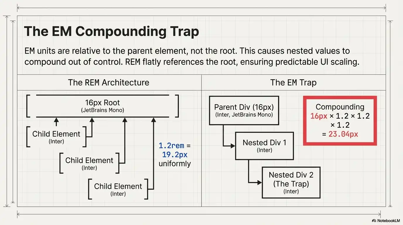
EM is relative to the parent element's font size, not the root. This means em values compound when you nest elements — a 1.2em inside another 1.2em doesn't give you 1.2 × 16 = 19.2px. It gives you 1.2 × 1.2 × 16 = 23.04px. This compounding is the main reason most developers prefer rem for general use and reserve em for specific components where relative-to-parent scaling is intentional.
If you're working with em, our PX to EM Converter and EM to PX Converter tools handle those calculations cleanly.
Using rem isn't a trend or a preference — it solves real engineering and accessibility problems.
1. Accessibility compliance. WCAG 2.2 Success Criterion 1.4.4 (Resize Text) requires text to be resizable up to 200% without loss of content or functionality. Rem-based typography respects browser-level font size changes. Pixel-based typography does not. If you use px for font sizes, you may be failing this criterion without realizing it.
2. Design system scalability. When every size in your system is defined in rem, you can adjust the entire visual density of your interface by changing one CSS property: html { font-size }. This is useful for theming, for adapting to different devices, and for supporting user preferences like compact vs comfortable density.
3. Consistent proportions. When both your typography and spacing use rem, the ratio between text size and surrounding space stays constant across breakpoints. A heading that has 1.5rem bottom margin always has spacing proportional to a 2rem heading, regardless of the root size.
4. Cleaner media queries. Some developers even write breakpoints in rem: @media (min-width: 48rem). This means the breakpoint itself responds to the user's font-size preference, which can produce more appropriate layout shifts for users who've increased their default text size.
Yes — with one condition. The root font size must be 16px, which is the browser default.
If your CSS sets html { font-size: 20px; }, then 1rem = 20px and 16px ≠ 1rem. In that case, 16px to rem would be 16 ÷ 20 = 0.8rem.
If you haven't touched the root font size and the user hasn't changed their browser settings, you can safely assume 1rem = 16px. But it's always better to be explicit. Know your base. When in doubt, check with the PX to REM Converter using your project's actual root font size.
This article gives you the knowledge. The tool gives you speed.
Our PX to REM Converter is built for developers who need instant, accurate conversions without mental math:
Whether you're converting 12px to rem for body text or 40px to rem for a hero heading, the tool gives you the answer in under a second.
Ready to get perfect rem values in seconds?
Open the PX to REM Converter →Also available: REM to PX Converter | PX to EM Converter | EM to PX Converter
Divide your pixel value by the root font size. With the default root of 16px: rem = px ÷ 16. Example: 20px ÷ 16 = 1.25rem. Use our PX to REM Converter for instant results with any base size.
1rem equals the root font size. In most browsers, the default root is 16px, so 1rem = 16px. If the root font size is changed to a different value, 1rem equals that value instead.
Yes, when the root font size is the browser default of 16px. If your CSS changes the root (e.g., html { font-size: 10px; }), then 16px would equal 1.6rem, not 1rem.
The formula is: rem = px ÷ root font size. With a 16px root: rem = px ÷ 16. To reverse it (rem to px): px = rem × root font size.
Use rem for font sizes, spacing (padding, margin, gap), and layout widths — anything that should scale with user preferences. Use px for borders, box shadows, and fine visual details that should stay fixed. This approach supports both responsive design and accessibility.
REM values recalculate automatically when the root font size changes — whether through CSS media queries or user browser settings. This means your entire layout scales proportionally without manually updating individual values at each breakpoint.
The root font size is the font-size value set on the <html> element. Browsers default this to 16px. All rem values throughout your stylesheet are calculated relative to this single value.
Converting px to rem is foundational CSS knowledge for any front-end developer working on modern, accessible, responsive interfaces. The formula is simple: rem = px ÷ root font size. The default base is 16px. The benefits — accessibility compliance, responsive scaling, design system flexibility — are well-documented and practical.
Use the conversion table above for quick reference during development. Use the formula when you need to understand why a value is what it is. And when you need speed, use the PX to REM Converter to get instant, accurate results without breaking your flow.
Last updated: March 12, 2026. We review and update this guide regularly to ensure accuracy.